Overview
• Logo re-design & stationary
• Student project
Objectives
• Re-design the existing logo of Align HCM, representing the company's mission & values
• Apply new logo to stationary package
Research
• Team of human capital management experts
• Work with businesses, companies & corporations
• Mission is: "to simply & optimize workforce management systems so that everyone works together"
• Company values: strategy, collaboration & support
Design Concept
• Uses the shape of the 'A' in the same typeface
• Kept the 3 circle concept from the original logo, forming the rest of the letter 'A'
• Circles represent the 3 company values and how they work closely with their team & clients
• Font used: Arial Rounded MT Bold
• The font has curved edges, complimenting the circles curves
• Avoids any harsh or sharp edges
• Colours: vibrant blue & dark navy
• Blue is a highly corporate colour representing intelligence, responsibility & stability
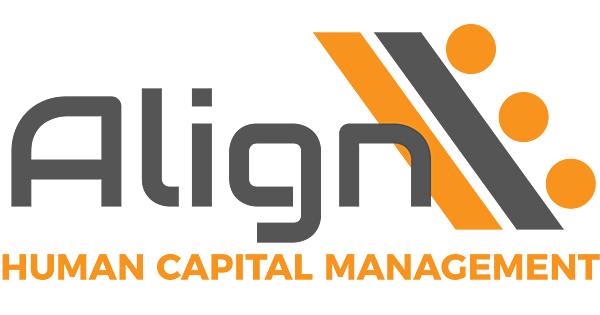
Logo Before
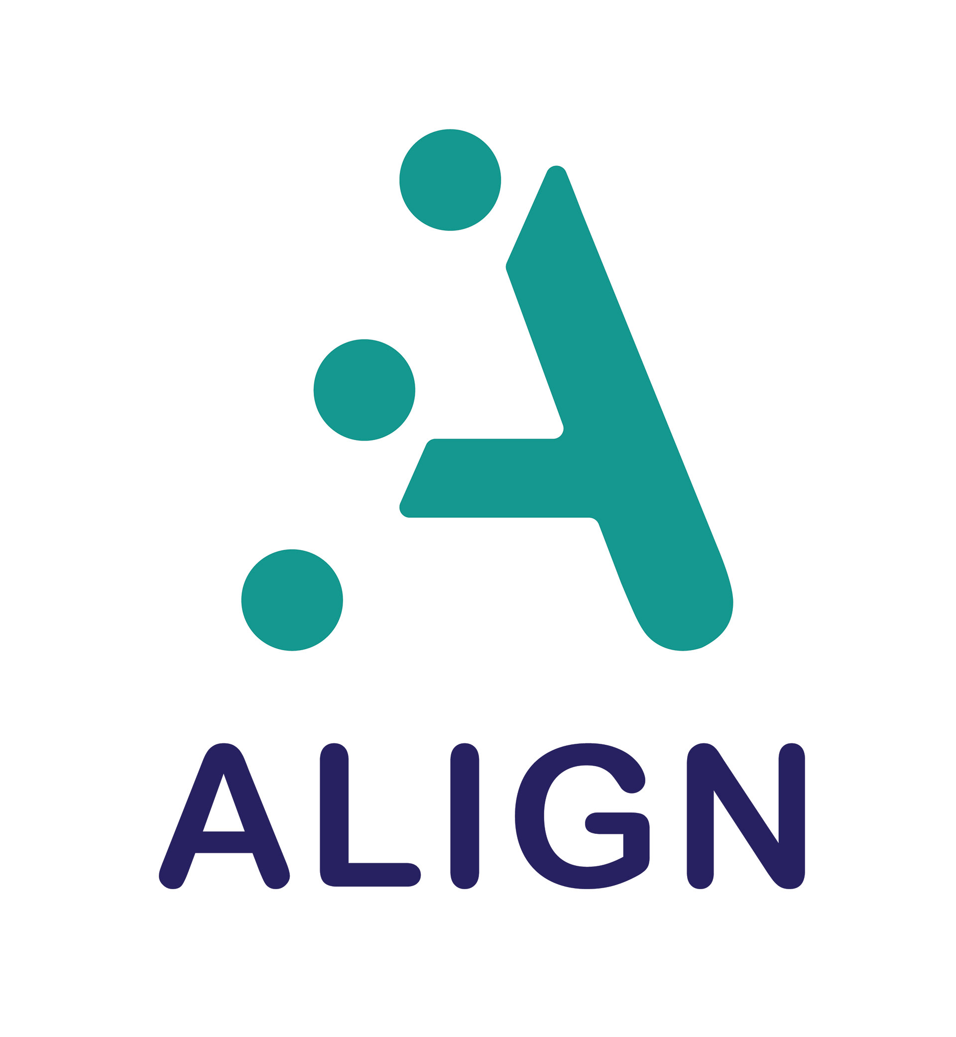
Logo After
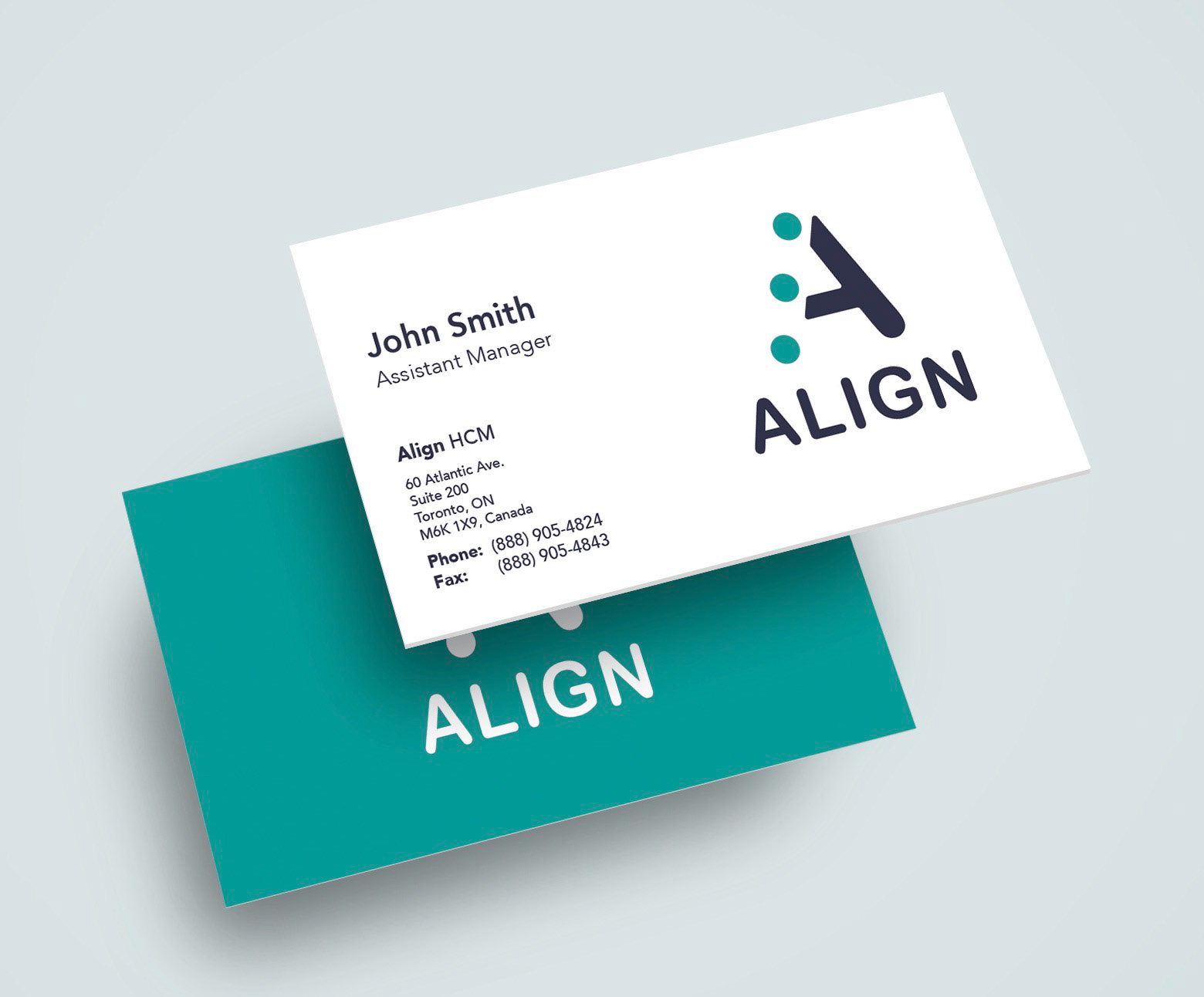
Business Card Design
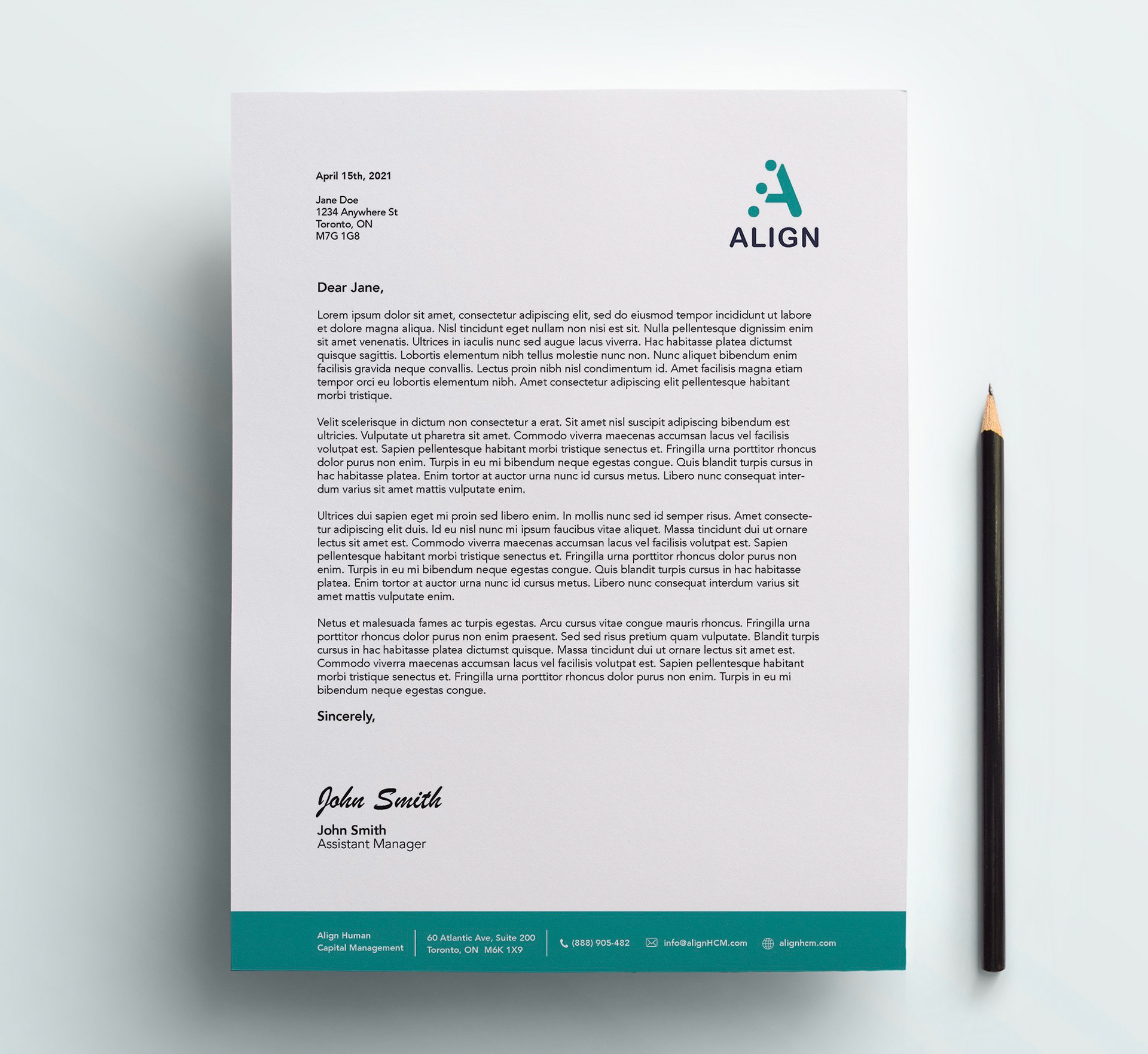
Letterhead Design